I developed a UI kit for an internal enterprise web application. It grown into library of styles and 40+ components built to speed up development.
Together with another designer, we put it together in Figma and documented everything so front-end developers could implement it as a React component library in Storybook. We also made sure it was flexible enough to apply in other projects.
6 months (2023-2024) + Ongoing maintenance
Design Kit for Enterprise Applications
Desktop and mobile
Desk Research
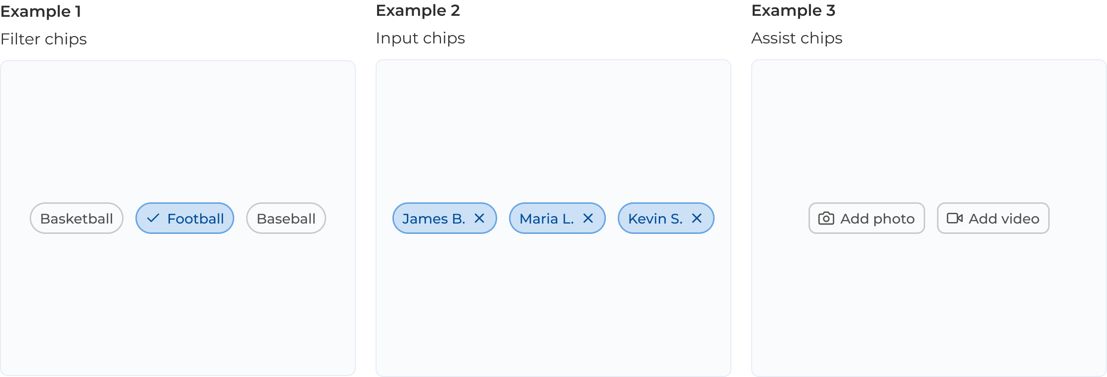
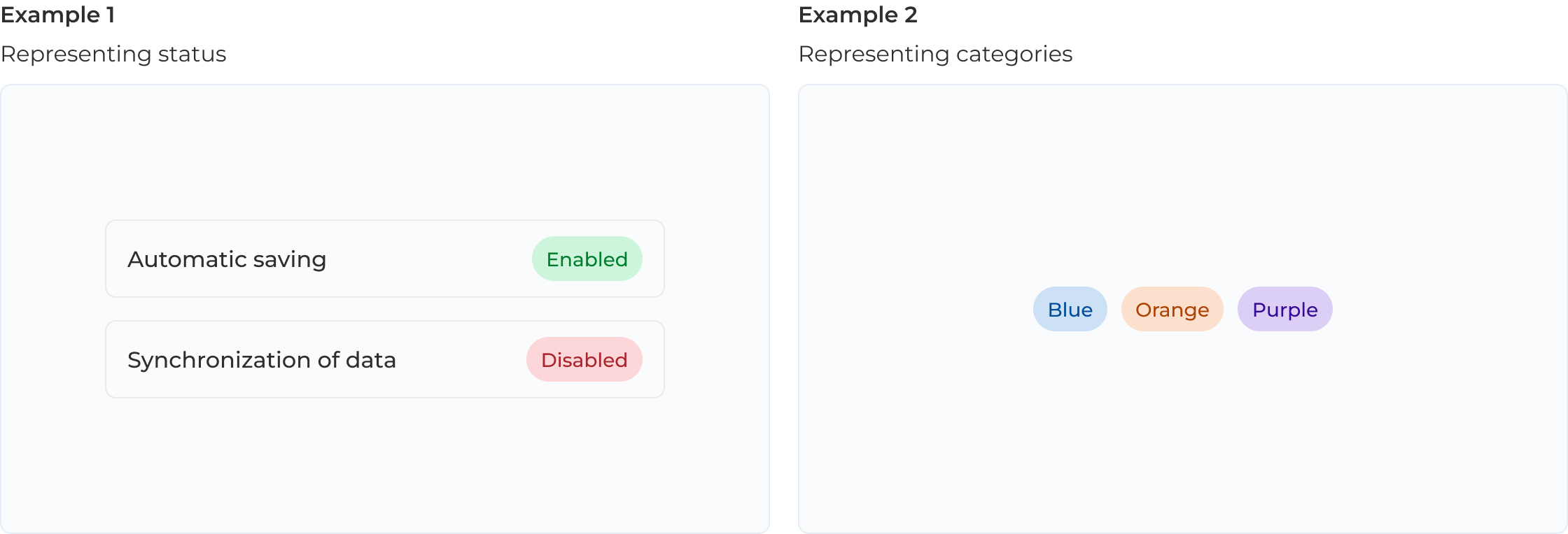
Component Design
Accessibility
Documentation
Testing & Maintenance
Design dev handoff time reduction
Ready to use for whole organization
As the application evolved, there was a growing need for a component library to maintain design consistency and improve development efficiency. Existing UI kits were too generic, lacking the flexibility to support unique requirements of complex enterprise system.
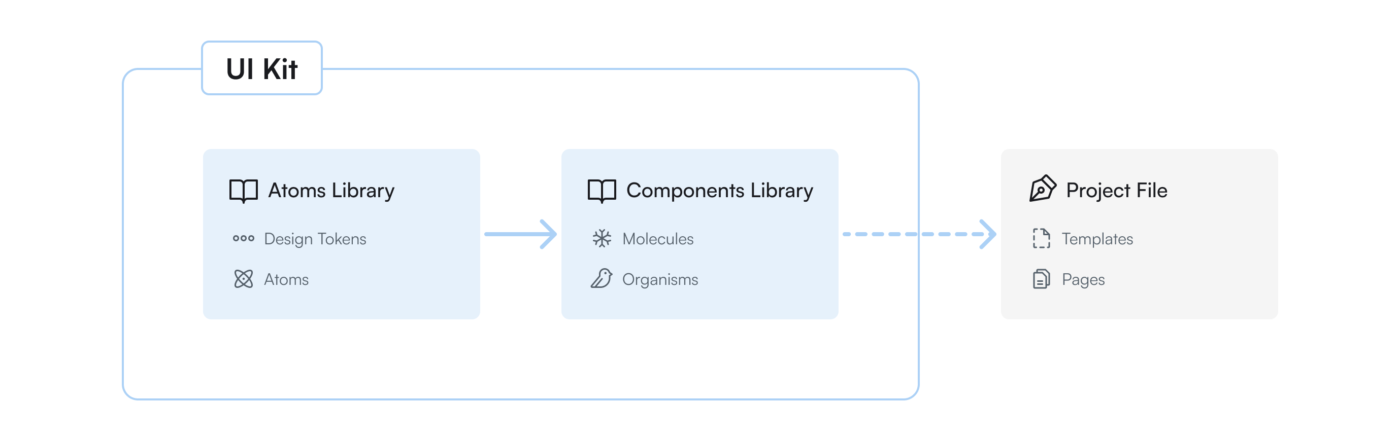
I worked on alligning the vision with stakeholders through a series of collaborative meetings. The concept was a UI kit built on Atomic Design principles, incorporating our organization's established color palette and the Feather Icons library.
The main goal was to create component library that allows for creating custom combo-components with ease, using established design atoms and molecules. The second objective was to create the UI kit in a way that makes it adaptable to other projects, enabling it to be used as a starting point for designing any application within our organization.
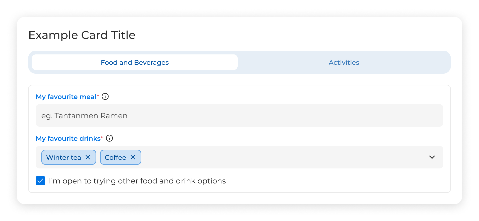
I started by designing components that were already used in the existing version of the application, prioritizing the redesign of current functionalities before preparing a complete kit to support new feature development and sharing across other products. To establish a consistent visual foundation and simplify development, we used Radix UI as the base for our look and feel.
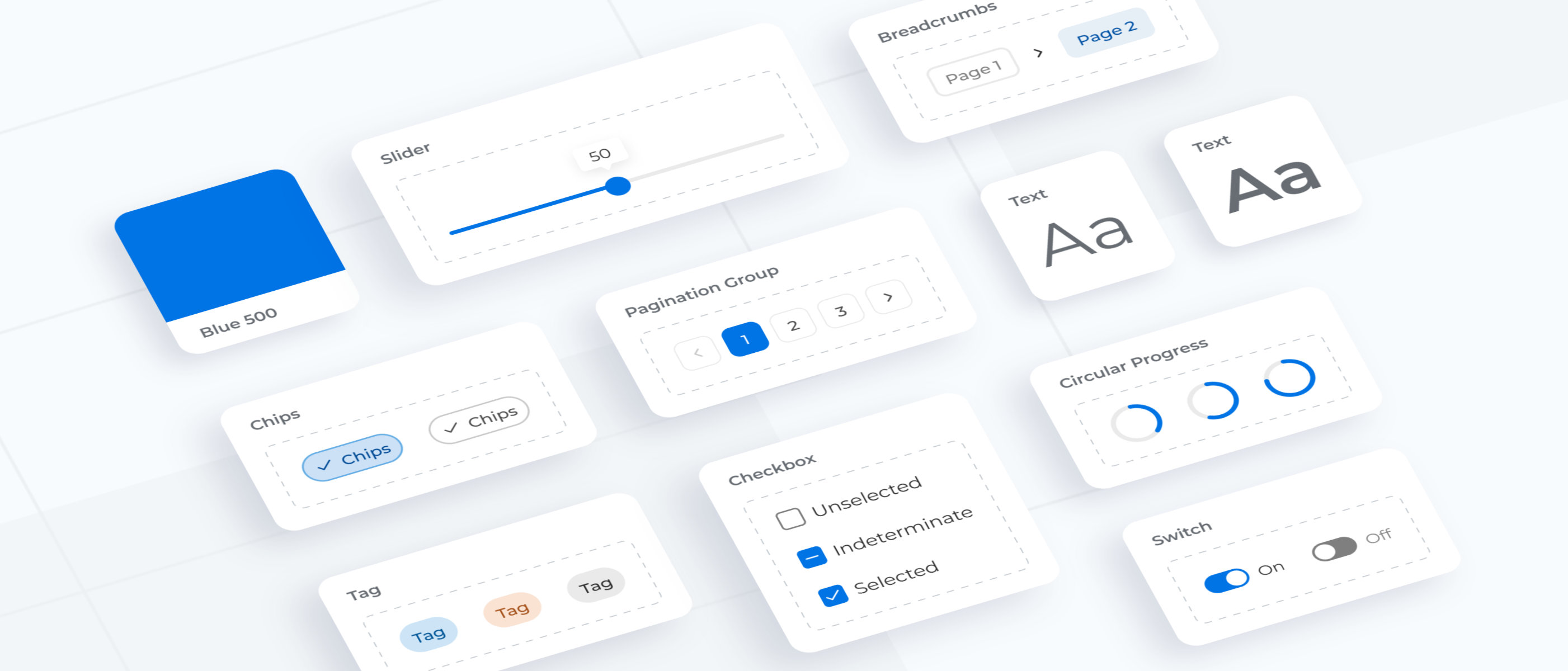
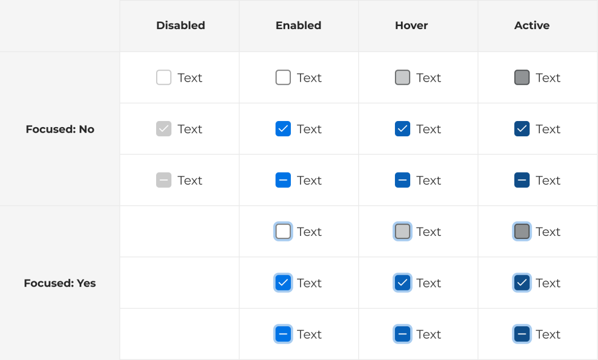
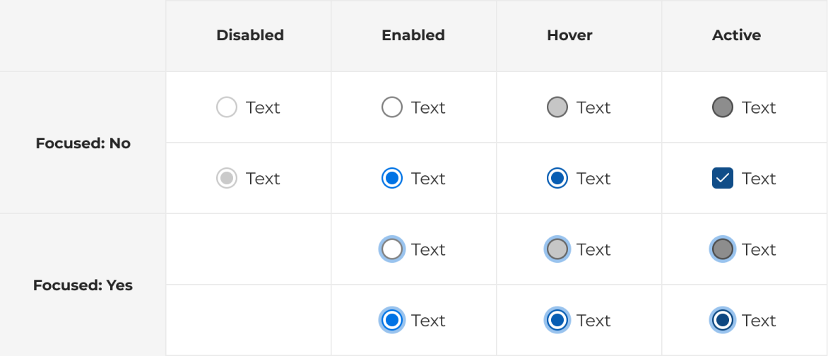
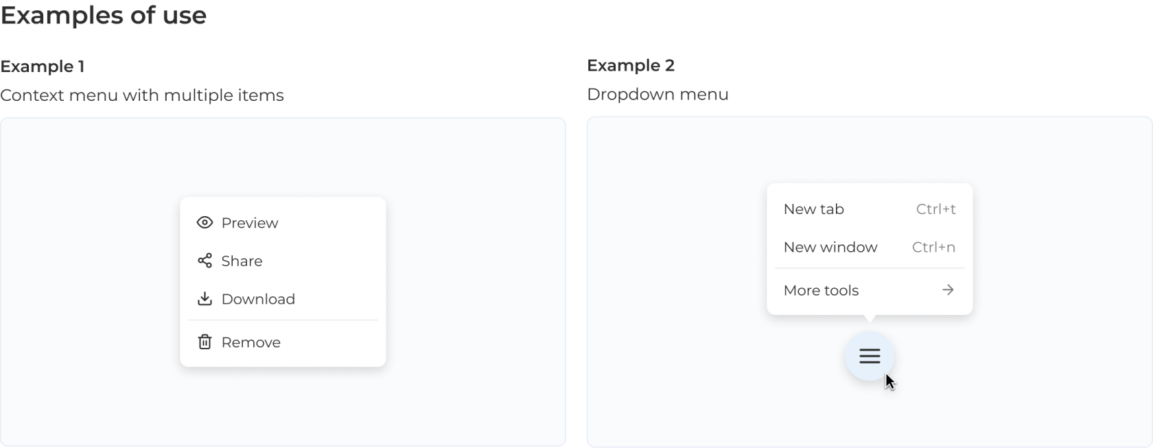
The UI kit continued to grow, and we eventually slowed down the addition of new components once the library included around 40, each designed with multiple variants and properties to suit different scenarios and support prototyping. At it's core, the most important aspect was simplicity and consistency, which allows for scaling the component base once there is a need for new elements within application.
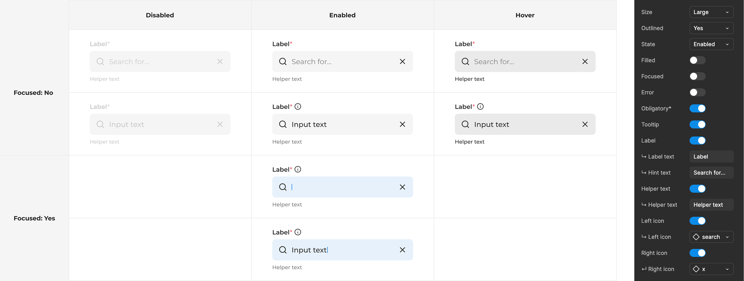
We prioritized the development handoff by asking developers to begin with the most fundamental elements, such as checkboxes, input fields, pagination, and buttons. These were implemented into the application design, which was initially created with manually coded UI elements. As the application grew, usage patterns revealed which new components were needed.
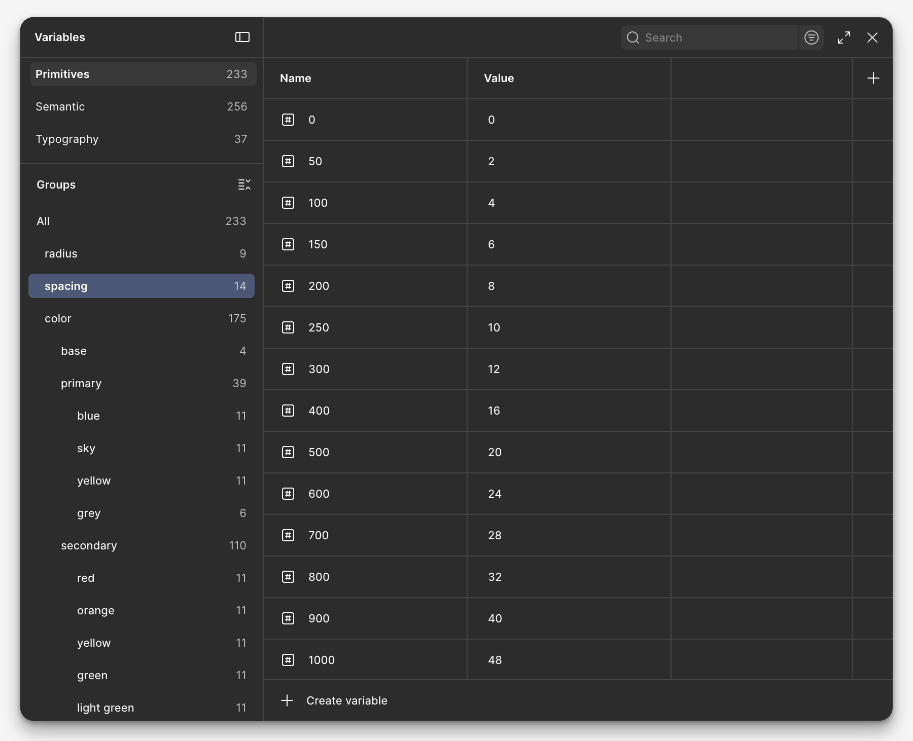
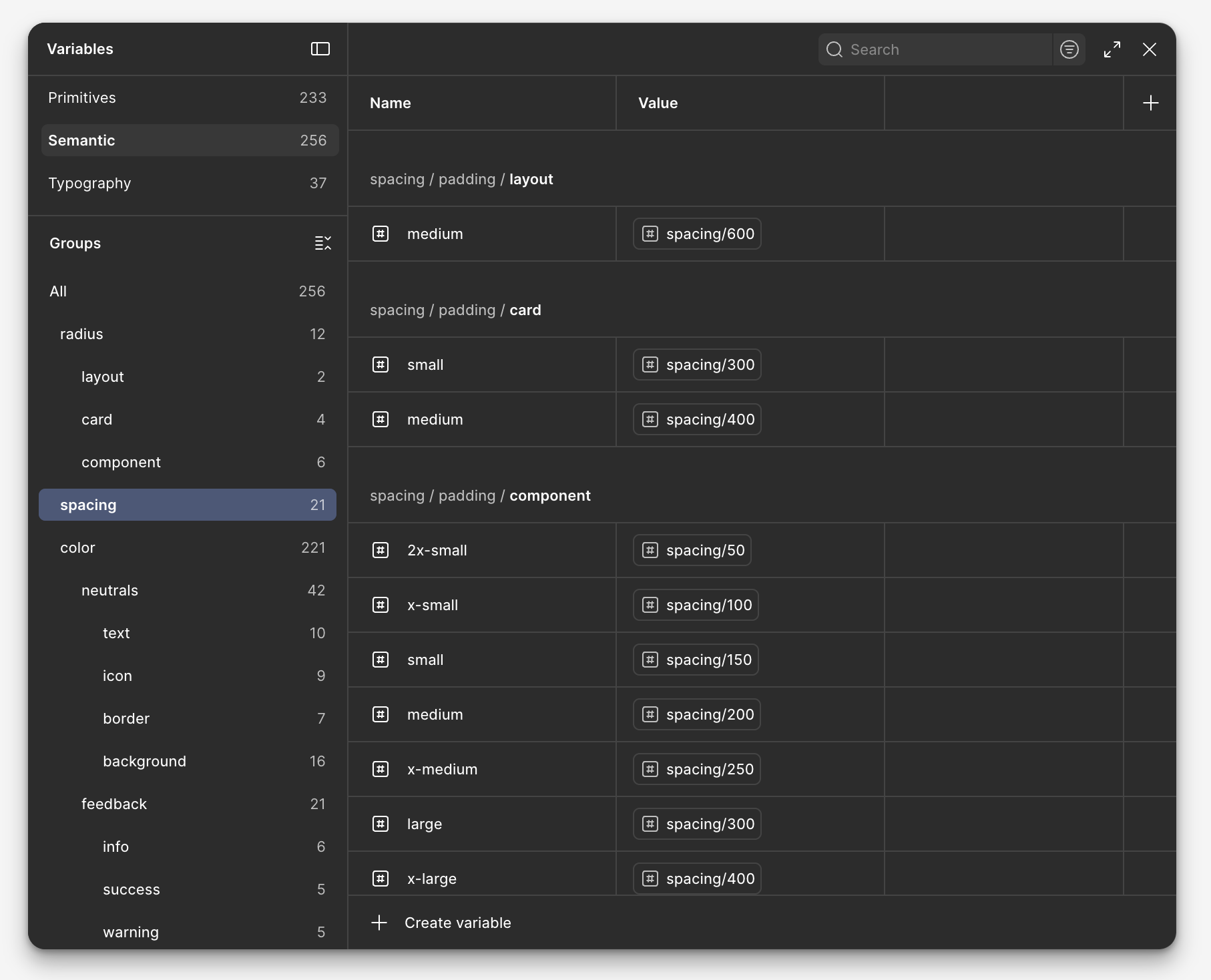
All components were based on a 4px grid and designed with responsiveness in mind. The UI kit was implemented as a React component library and Storybook.
We also created documentation on usage, variants, states, and best practices, ensuring the UI kit was easy to understand for anyone from organisation who would like to use it. This documentation included interactive examples and guidelines for how components should behave in different contexts.
We reguralry updated the UI kit as the project evolved to meet the changing needs of the product. New components were added when necessary, and existing ones were refined based on real use cases.
This ongoing iteration kept the system relevant and up to date, with the maintenance process driven by the practical needs of the primary application it supports.
The implementation of our UI kit delivered significant improvements across both design and development workflows. Design time for new features decreased by approximately 30%, as the UI kit made it easy to compose app specific combo-components from modular building blocks.
Development velocity saw a marked increase as well, with engineers spending less time on CSS details and more time building core functionality. Tasks that previously filled an entire sprint could now be completed with enough time left to address technical debt or optimization.
This project enabled me to enhance my visual design skills and grasp the impact that small design decisions can have on the entire design library as it evolves and scales. Dedicating enough time to establishing a clear strategy and design language at the beginning of the design process was essential for preventing inconsistencies and scaling challenges later on.
Beyond visual design, I developed stronger skills in documentation, cross-functional collaboration, and design systems management. This experience has shaped my approach to new projects, where I now emphasize establishing robust design foundations before diving into detailed interface design.