The main goal of AccessFlow is to enable engineers and managers within the organisation to access company data in an easy and compliant way. The scope of the data is very wide - datasets include sales data from across global markets, financial reports, operational metrics, and more.
I came on board to help the product grow by designing new features and improving existing ones. This case study focuses on document selection - one of the most important steps on the journey of data engineers who need to find and use the right documents for running algorithms and training AI models.
While grounded in professional design practices, specific details of this case study have been modified to protect confidentiality.
3 months (2025)
Enterprise Solution
Desktop web application
User Research
Wireframes
Usability Testing
Mockups
Supporting implementation
The average time to select data
After removing manual access approvals
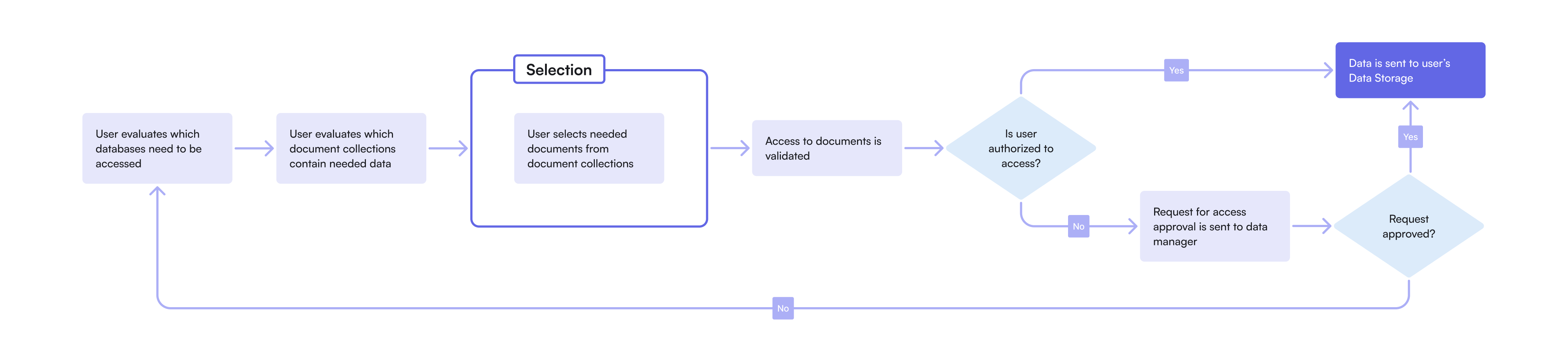
The Data Engineering team faced a challenge in managing document access across their workflows. Due to the growing number of documents and inconsistent access methods, the process had become manual, fragmented, and approval-heavy, often resulting in long delays.
I partnered with the Product Owner and key stakeholders to define business requirements for access management within the organisation. The primary focus at this stage was the Document Selection step, a key part of the process which ensures that users can quickly identify, request, and gain access to the right datasets without friction.
To better understand user workflows and gather insights for design, I conducted six user interviews with key roles: Data Engineers, Data Analysts, and Engineering Managers. The interviews focused on their document selection process, pain points and decision-making criteria. I then synthesized the findings into a research report, highlighting key challenges, user quotes, and opportunities for improvement.

I use various data for my work, but one of the key is sales data. The current process of accessing the data is painfull and can take weeks to receive approvals.

Several recurring pain points became evident during the interviews, which included the lack of consistency and transparency in the current access process. Different datasets followed different approval rules, and documentation was often outdated or incomplete, forcing users to rely on colleagues or trial and error.
At this point, I started thinking about potential solutions to the challenge. First, I created wireframes illustrating how selection of the documents might look like, focusing on a single-page approach that would give users a comprehensive view.
As I kept diving into user research and requirements became more defined, I realized that the amount of data we needed to display was higher than initially assumed. Quick corridor testing sessions confirmed that users felt overwhelmed, leading me to abandon the single-page concept.
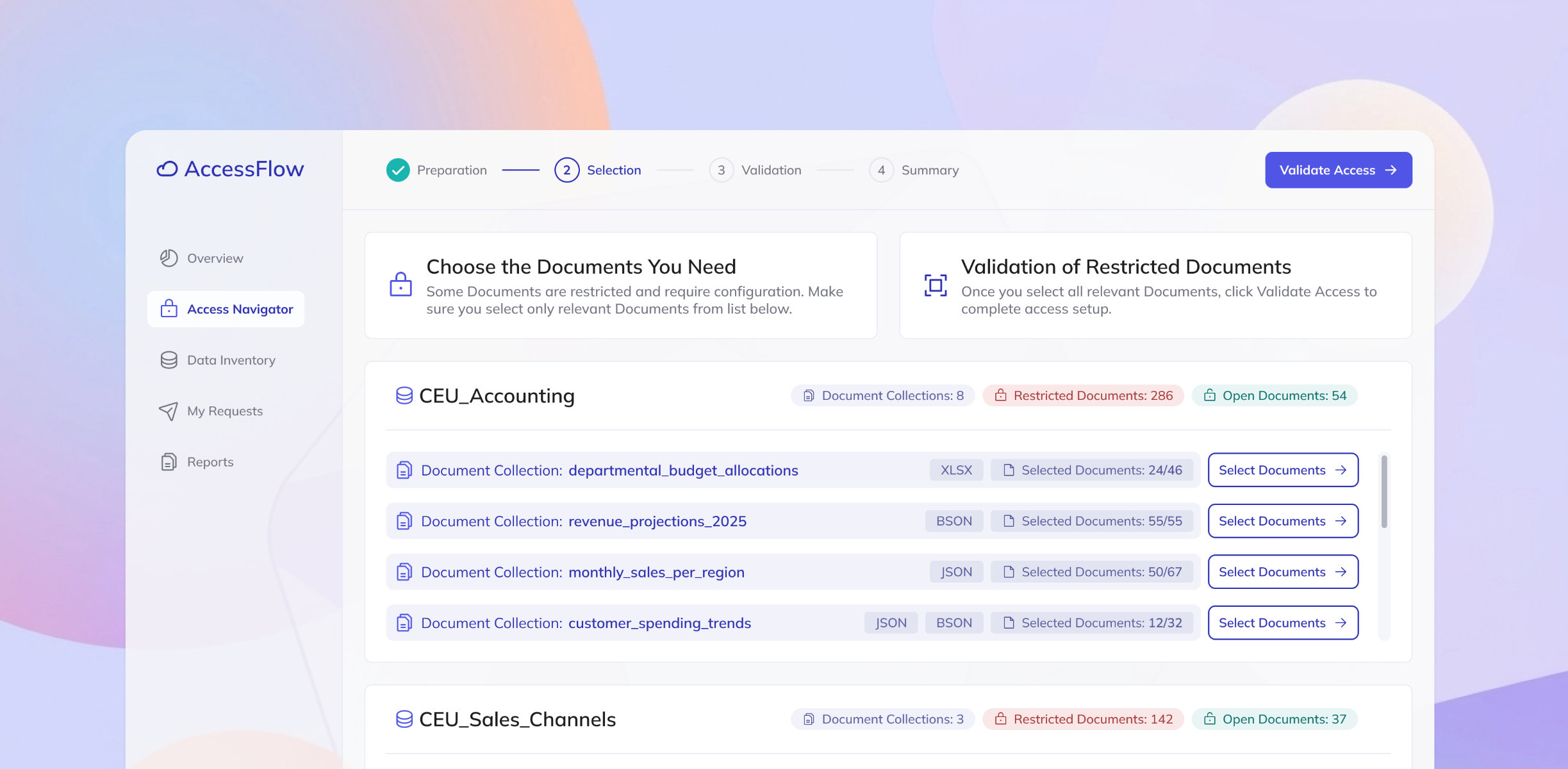
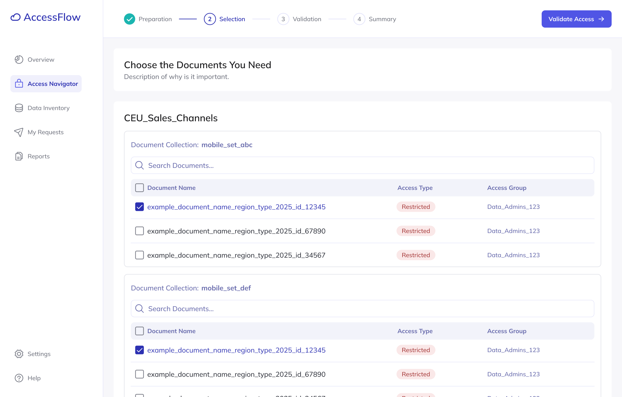
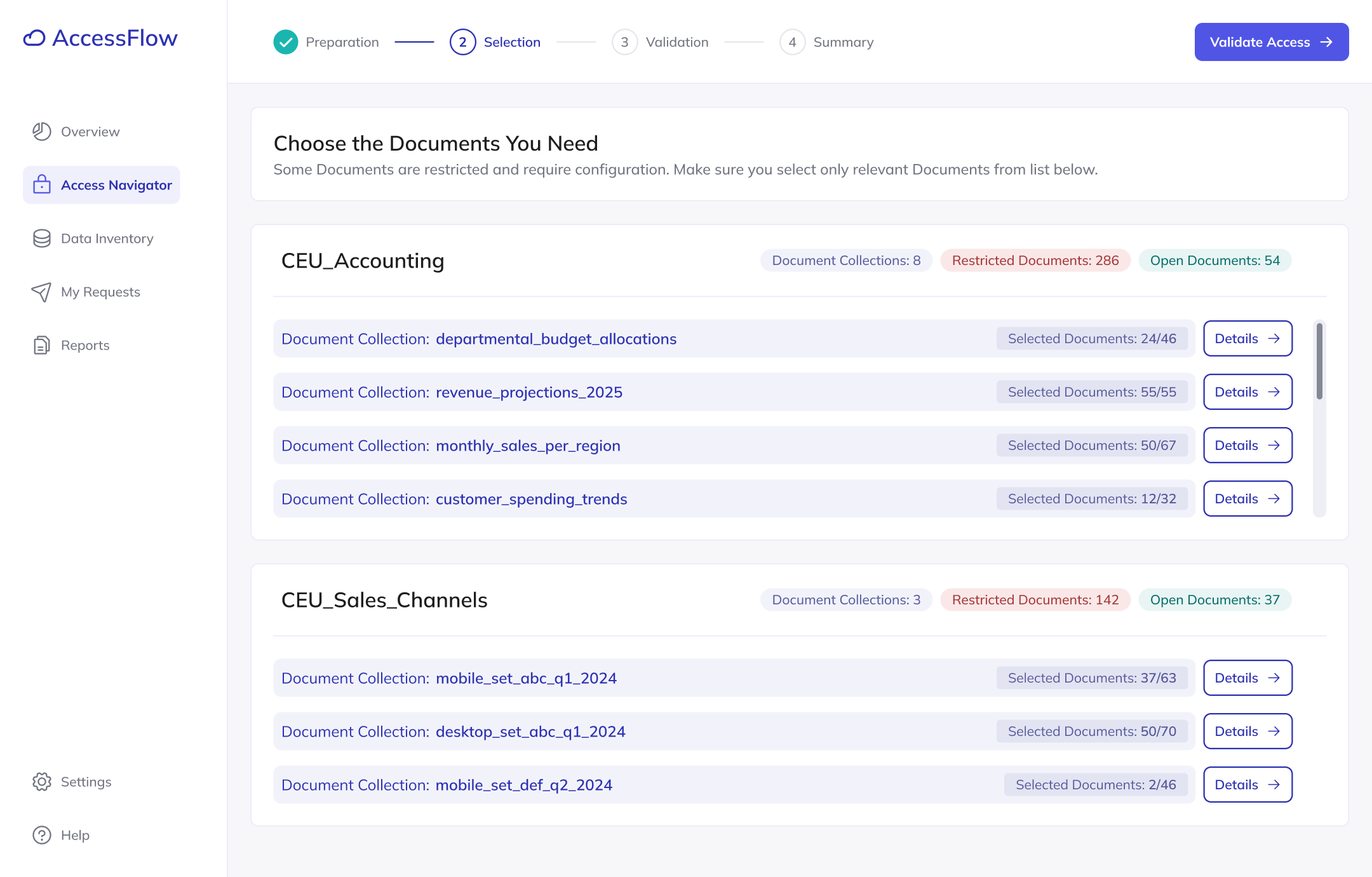
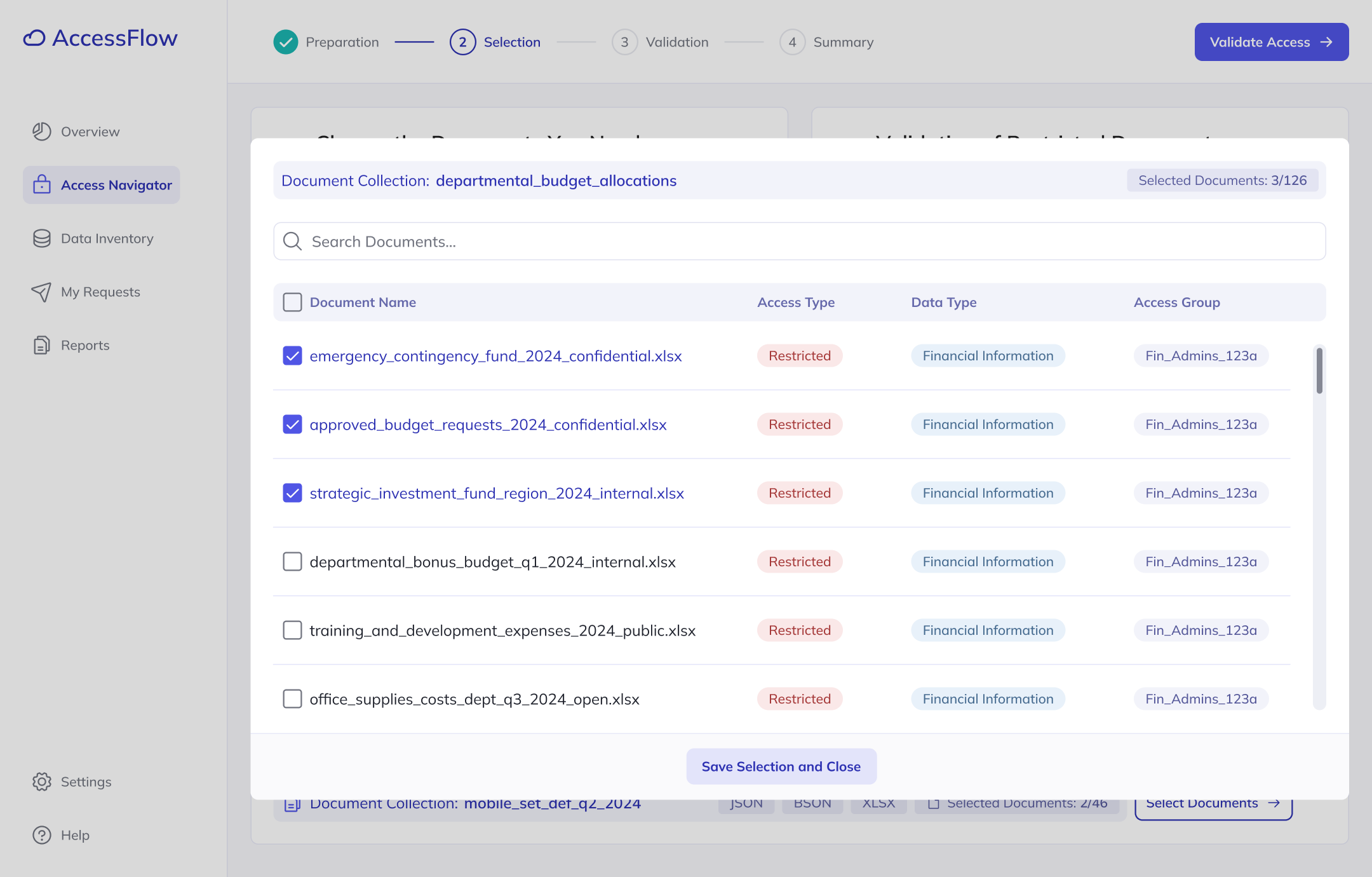
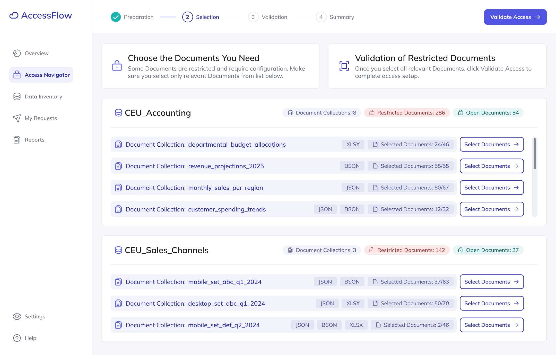
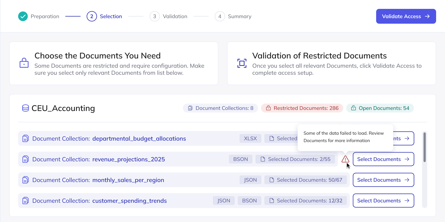
My new approach showed list of document collections on the main screen. The user then can go into view of each collection to see details about specific documents. I tested this revised design with seven users in moderated usability sessions, asking them to complete four key tasks related to document selection and access.
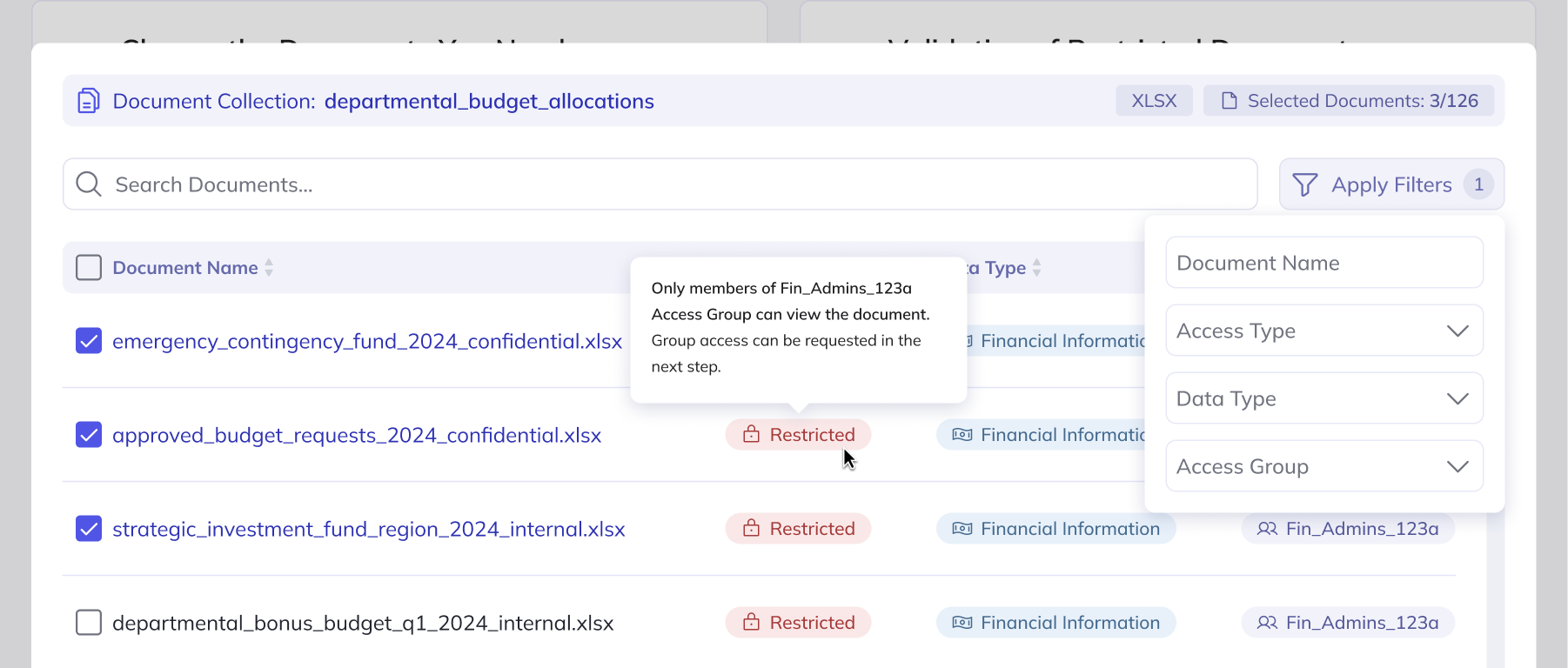
It's unclear to me what can be found under the "Details" button and why access validation is necessary. For someone unfamiliar with the process, additional explanation would be helpful.
The new design performed significantly better, with no critical usability issues detected, allowing me to refine the design based on user feedback and minor adjustments.
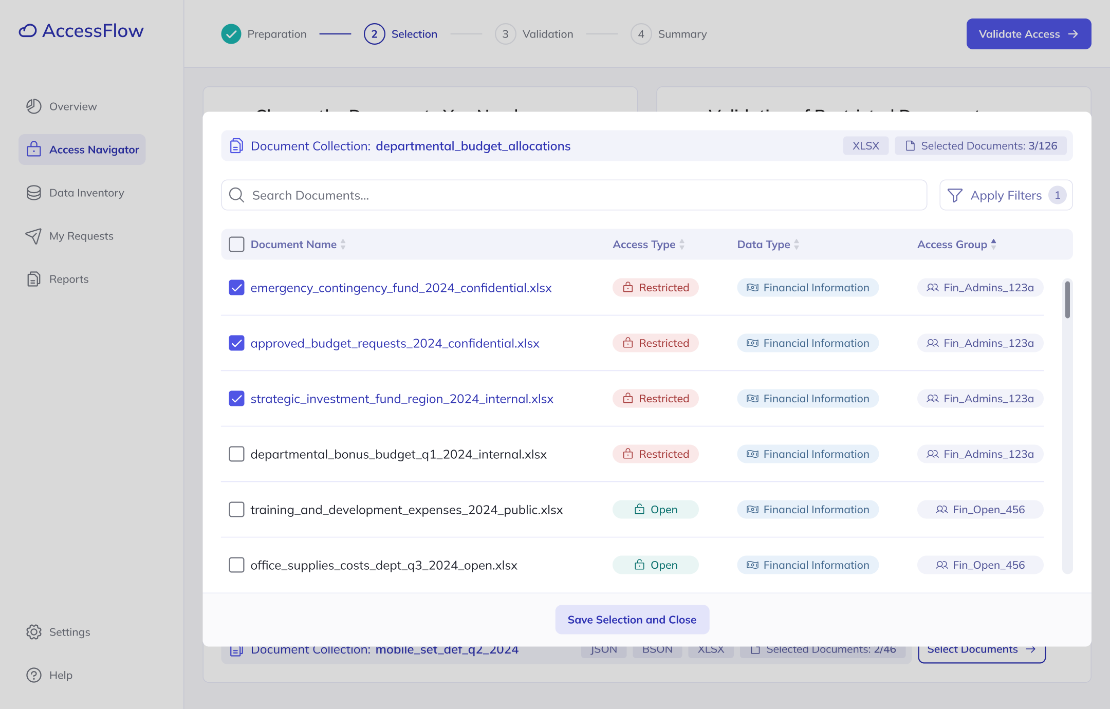
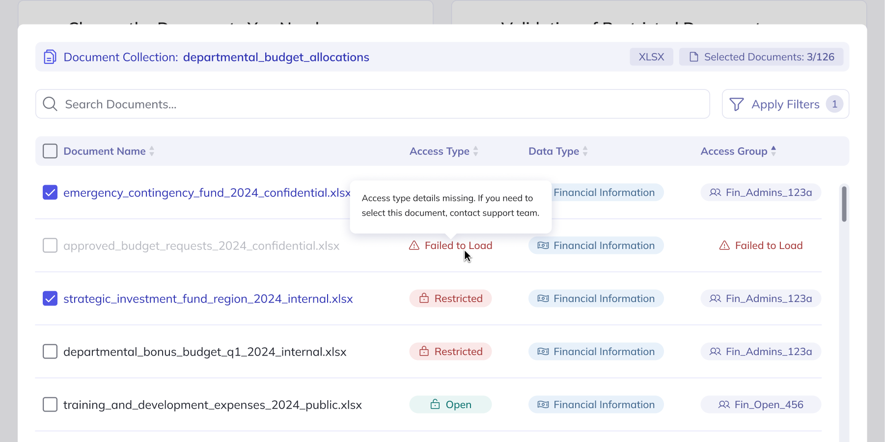
Testing provided valuable insights on improving how the interface communicates tasks and revealed additional user expectations, such as the need for document format details and explanations, which were implemented through tooltips. User feedback also led to the introduction of filtering options, making it much easier to navigate large volumes of data.
After improving the tested screens, it was time to start refining them with the development team. This process uncovered many technical constraints which had to be considered in the interface. Integration with external systems containing information about access types, access groups, and their members led to identifying many cases of missing data and problems with synchronization.
To not leave users encountering generic error messages, I designed contextual error states with clear explanations and guidance for common issues to make sure that experience of error recovery is intuitive.
The average time it takes to select and receive data. Before, users had to manually verify access rules - cross-checking who could access what and under which conditions, jumping between documentation and legacy systems to piece it together.
One of the most valuable takeaways was the deep dive into user research, which went beyond business requirements to uncover the real challenges users face. These insights shaped my design decisions, but collaborating closely with developers was just as crucial - it gave me a better understanding of technical constraints and pushed me to discover ideas that prevent confusion during errors.
Looking back at the design decisions made, I would involve developers even earlier in the process to identify technical constraints before implementation phase started.
Overall, working on this feature was a challenging yet rewarding experience that helped me build confidence in navigating technical requirements and integrating them with user insights to create an intuitive solution.