SwiftPay is a payment gateway that allows e-commerce businesses and online stores to easily accept digital payments through online bank transfer that instantly debits their customer’s savings account. With over 500 businesses using the solution, SwiftPay has become a significant player in the local fintech scene. At the time, design of the gateway became outdated, so I approached the challenge of redesigning it.
2 Months (2022)
Commercial Project
Desktop and mobile web app
Competitor analysis
Wireframes
Mockups
Accessibility
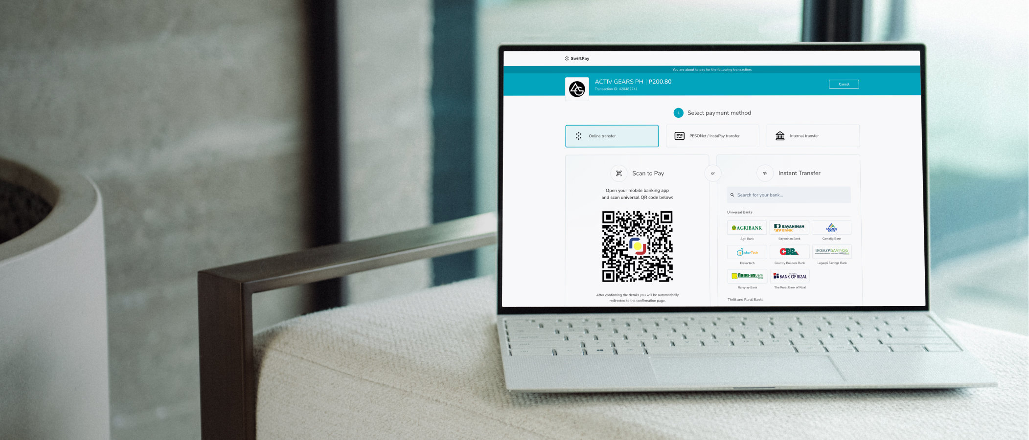
Highlighted merchant identity and key transaction details
Reduced friction by prioritizing most-used payment flow
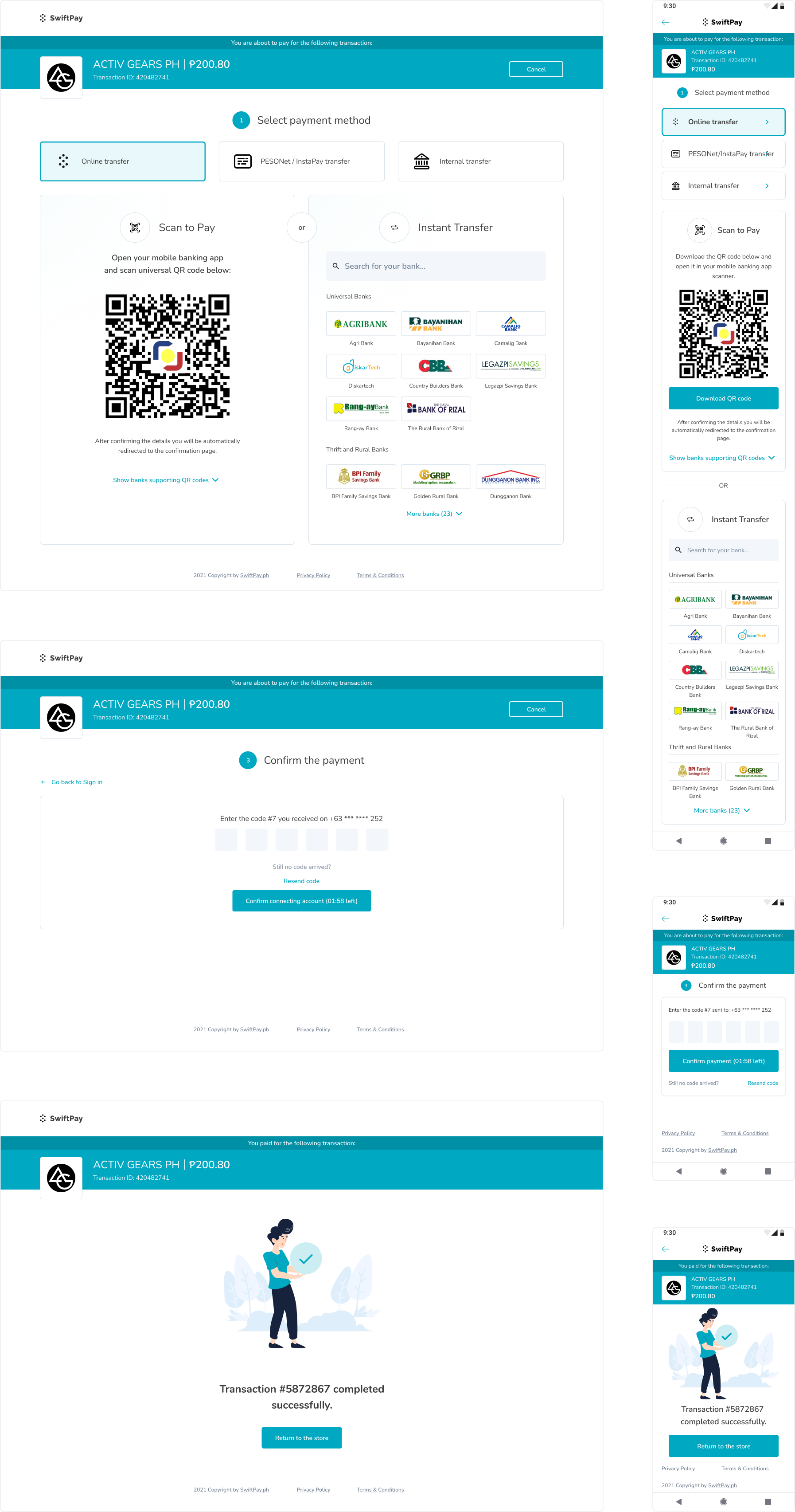
"Scan to Pay" has grown significantly in popularity in Philippines over the past two years as a form of payment in brick-and-mortar stores. The payment gateway design didn't prioritize the "Scan to Pay" feature, requiring users to select it before each payment. Additionally, the transaction summary bar lacked emphasis on transaction details.
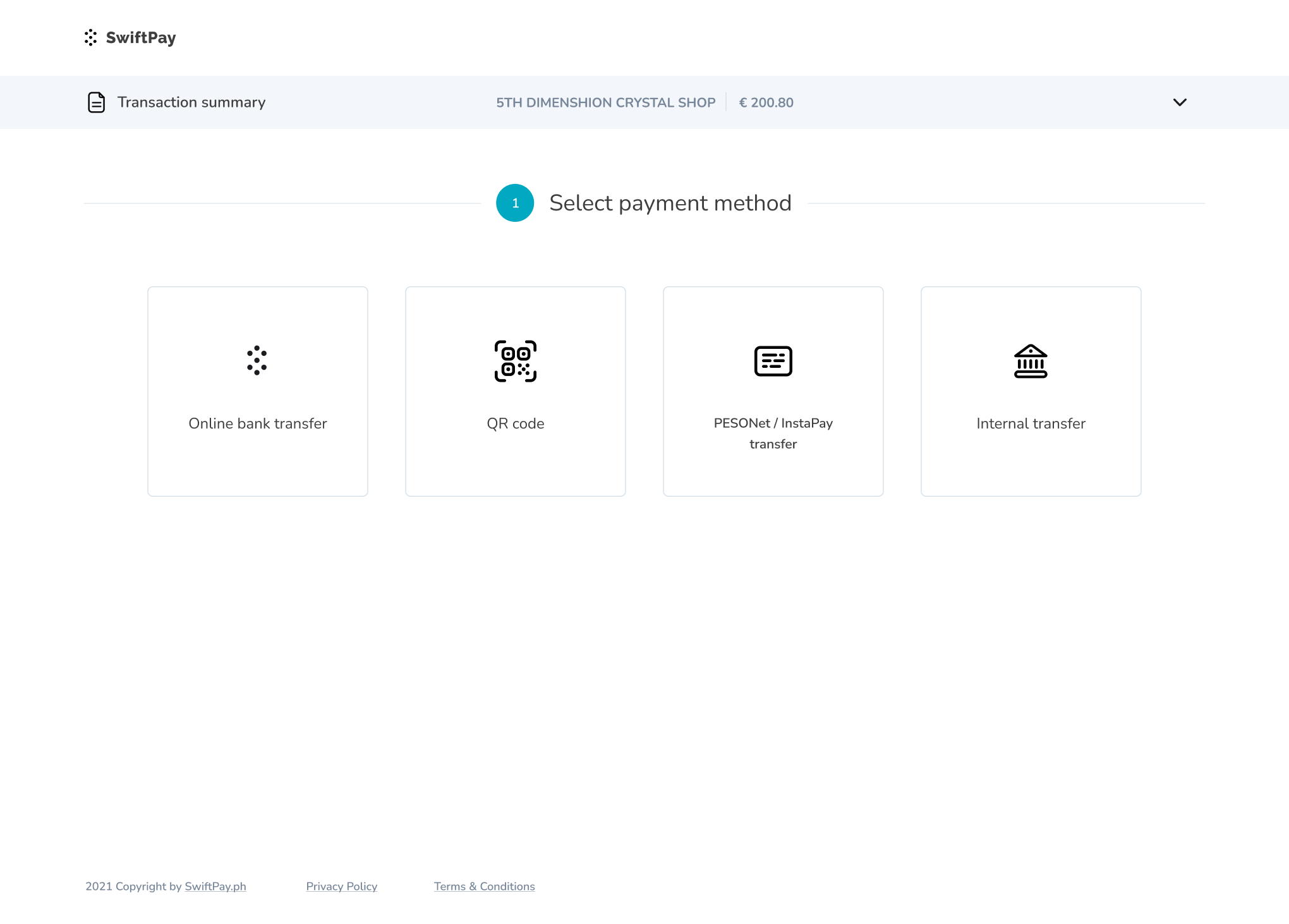
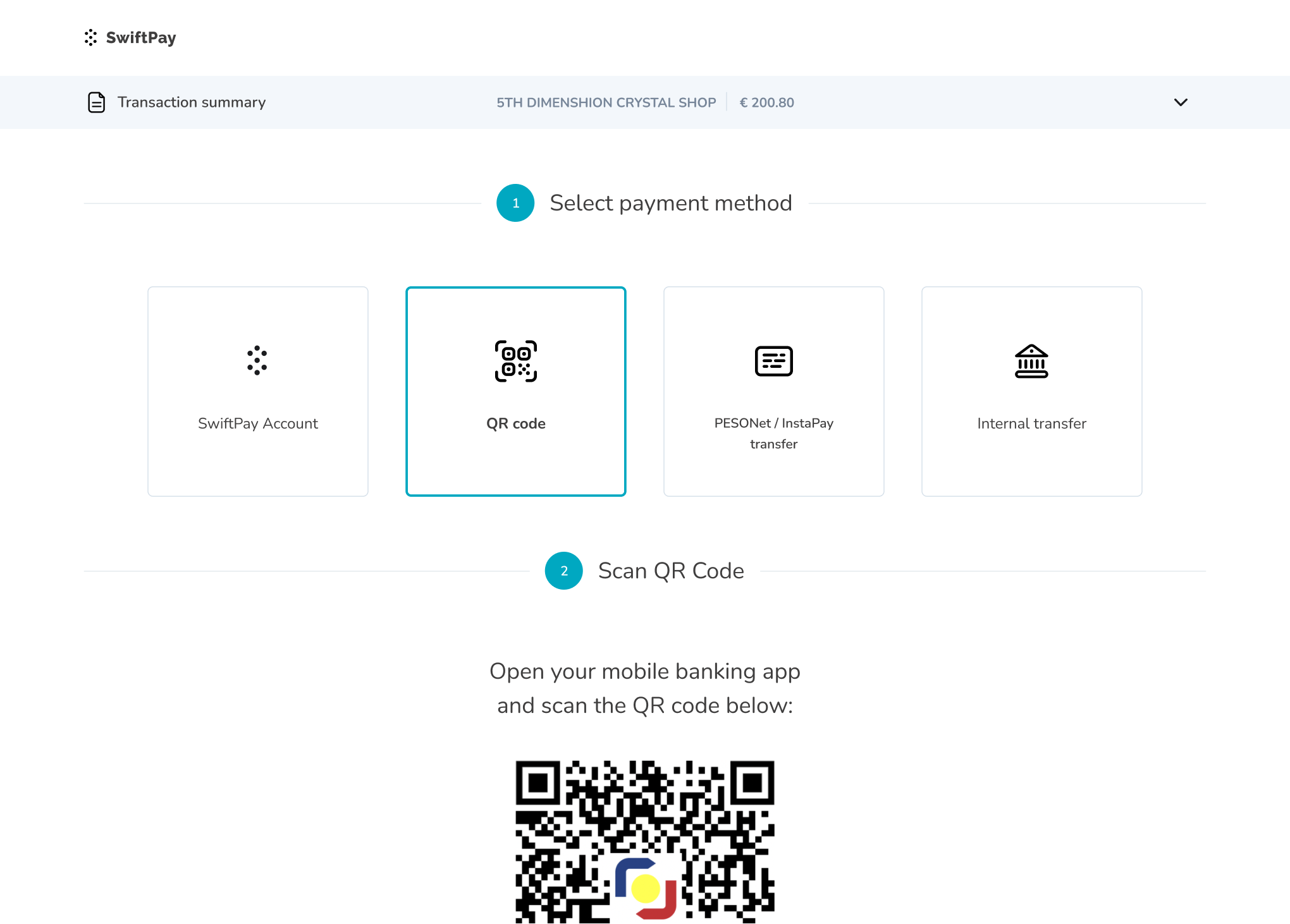
I was provided with an existing design of a payment gate, which served as a base for improvement. The design had several issues:
- Interface with equal visual weight given to all payment options
- Poor information hierarchy that didn't highlight transaction details
- Lack of emphasis on merchant's logo, which diminished trust
Based on quantitative data gathered from usage statistics over several months, it was clear that "Scan to Pay" and "Online bank transfer" were the most commonly used functions by existing users, while the other payment methods were choosen less frequently.
This data led to idea of connecting "Scan to Pay" and "Online bank transfer" into one named "Online transfer". The new payment method is selected by default, to assure seamless payment experience without having to switch between payment options.
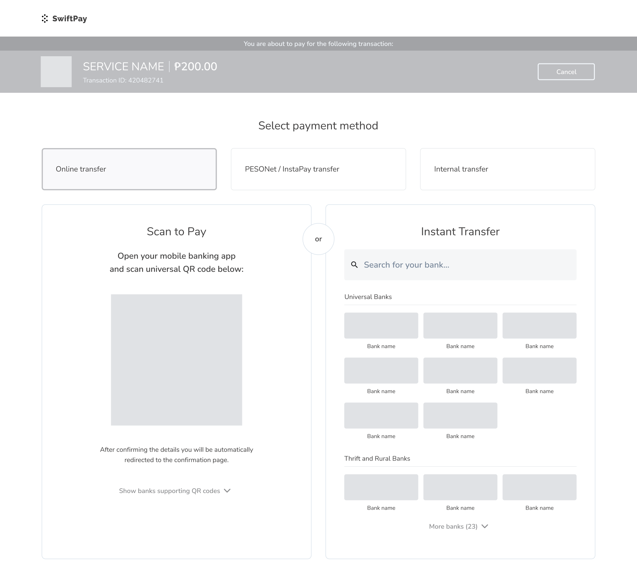
The previous transaction summary bar showed neccessary details about transaction, but lacked visual emphasis on the most important elements, such as transaction amount and merchant's logo. The visual connection to the service on which the shopping is done was especially important due to many financial frauds happening in Phillipines.
The new solution had a goal to assure user they are paying for the right transaction to the right service, which we aimed to achieve by displaying merchant's logo and adding an additional information about payment progress. Additionally, I worked on refreshing the UI, by highliting most important information and improving the layout.
This project gave me direct insight into how UI improvements can significantly impact everyday user experiences. By restructuring previous approach to payment methods, we were able to shorten users path to finilazing transaction, which is critical during payment process. Moreover, the new transaction summary bar has a potential to increase users trust in using Swiftpay, which was planned to be verified after development.