At its core, Value Insight helps sales and marketing managers understand how their brand is performing and what's driving its growth or decline. This application existed for more than 10 years and despite continuous improvements, experienced slow but progressive decline in the user base.
I came in to the project to discover why users leave application, what made others stay and propose a new direction for the product.
While grounded in professional design practices, specific details of this case study have been modified to protect confidentiality.
6 months (2025-2026)
Enterprise Solution
Desktop web application
UX Strategy
User Research
Wireframes
Usability Testing
Mockups
AI Prototyping
Identified root causes and aligned team around new strategy
Combined qualitative research with analytics to guide product direction
Discover the root causes behind declining usage and redesign the product to reverse the trend.
To understand reasons behind decline, I needed to connect directly with users. I began by scheduling 5 qualitative, moderated one-on-one interviews, each lasting 30 minutes. As I spoke with people, I saw many differences in how they used the application based on their role, seniority and geographic market. These early findings convinced me to expand the research to 10 interviews.
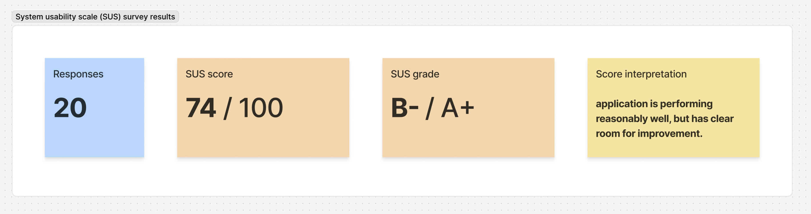
In addition to interviews, I conducted a system usability scale (SUS) survey to quantify the usability of the app and identify areas requiring improvement.

I usually use Value Insight as a topline view and don’t go into details. I prefer switching to the Power BI report for deeper analysis.

I find the analysis in Value Insight to be overly simplified. I’d like to have more information about specific products within my category.
I’ve never used the market comparison or price size features. I didn’t even know Value Insight offered them.
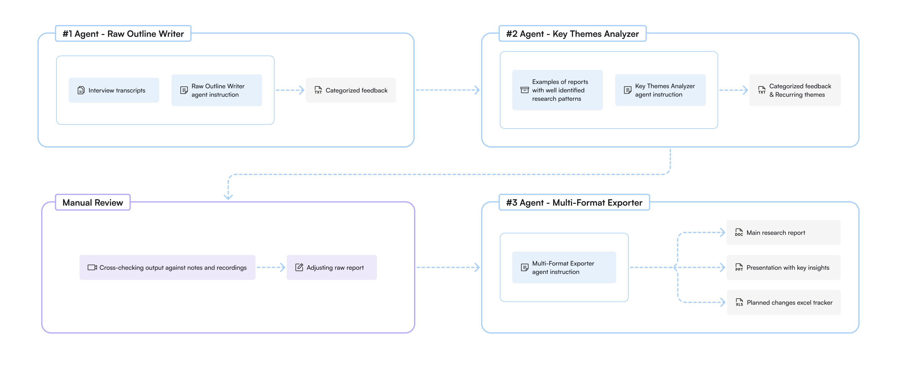
Using meeting transcripts and a dedicated AI agent for summarizing research, I was able to save time on manually outlining findings and instead focus on reviewing the most important moments from interviews to catch details the AI agent missed.
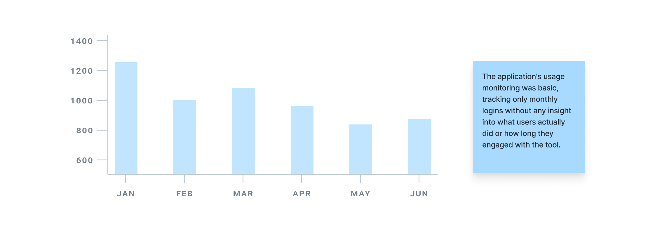
The interviews revealed a critical issue: users weren't utilizing features the team had spent many hours developing and improving. This presented an immediate opportunity to increase cost efficiency. To confirm what I was hearing, I requested that the development team introduce Google Analytics to track which parts of the application were actually being used.
Users say they use Value Insight as a top line view and go to PowerBI dashboards for more details
Users only use business drivers analysis and never used market comparison or size of prize
Users find at least part of table view valuable, but 7/10 out of them haven’t explored all it’s functions
Users find email subscription feature useful and say that their alerts are up to date.
Users say they would like to be able to view business drivers for every data point, not only for outliers
Users say they use graphs in reports and presentations and would like an easier way to export them.
Over time, many users moved into different roles and no longer needed the tool. Combined with usability challenges and the availability of Power BI dashboards that achieved similar outcomes, new adoption was weak and the user base steadily declined.
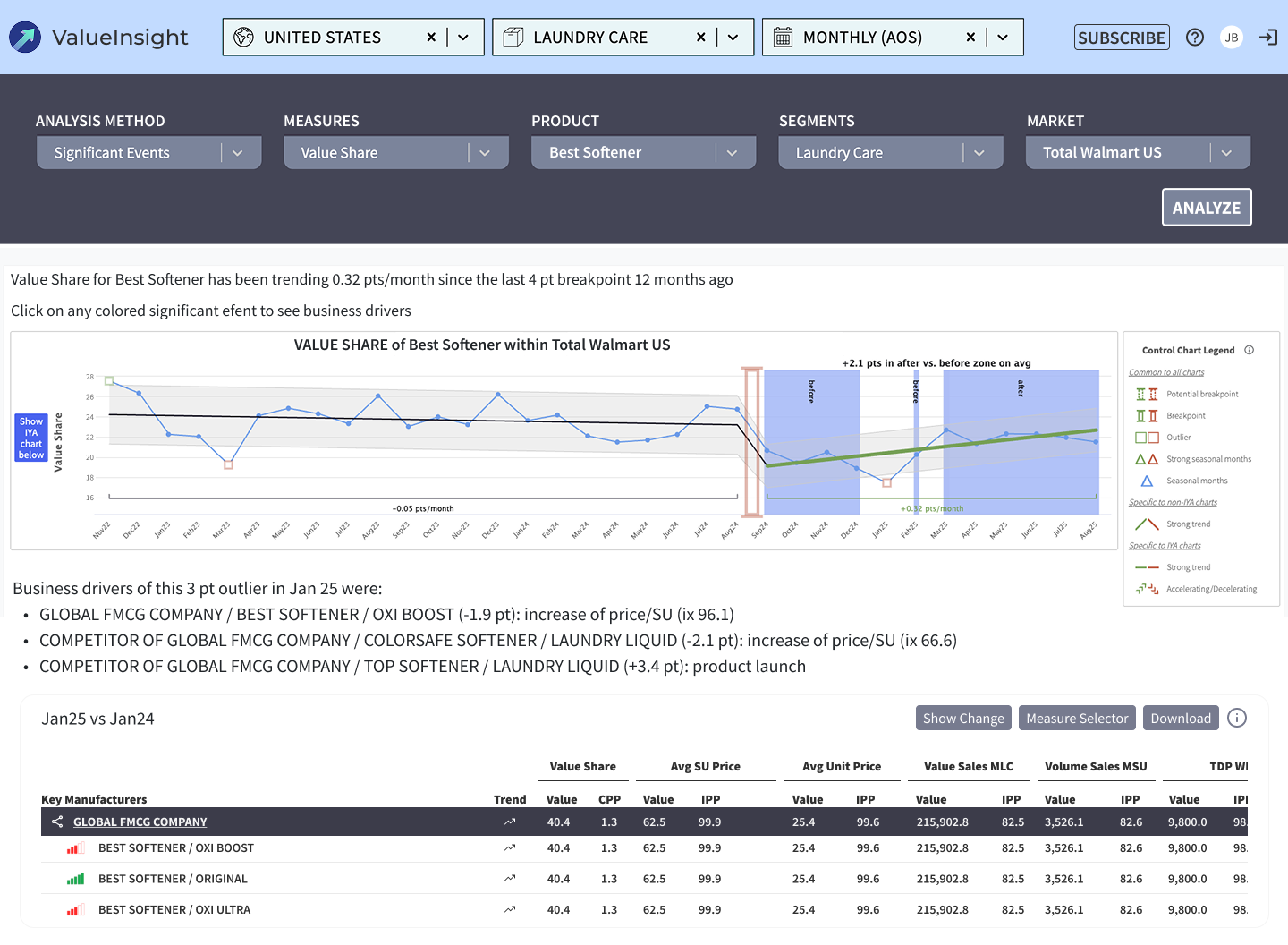
I presented all the research insights to the team, and we decided to prioritize our efforts on leveraging the algorithmic capabilities of Value Insight fully. The algorithm is the most important part of the application, yet it has been heavily underutilized. It has the potential to clearly synthesize data on key manufacturers and identify the reasons behind their growth or decline. However, the UI was unclear, and the tool only displayed a limited range of business drivers.
My next step was to identify key patterns in the research data and translate them into actionable items. I proposed several recommendations to the team based on the research, all focusing on high impact improvements:
Redesign the main app feature with improved structure and explore using LLM capabilities
Implement Google Analytics to track feature usage and user behavior patterns
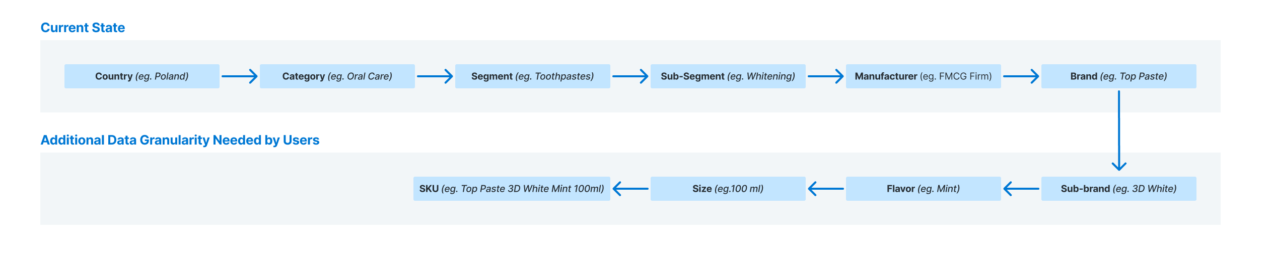
Assign dev team to review how the algorithm handles new SKU introductions, delistings, and merges
Reassess algorithm's criteria for classifying competitors as business drivers
The application's UI presented several critical issues. Most notably, the information architecture lacked intuitiveness. There was no clear pathway for users to return to the main page, where key features such as market comparison and size of prize were accessible.
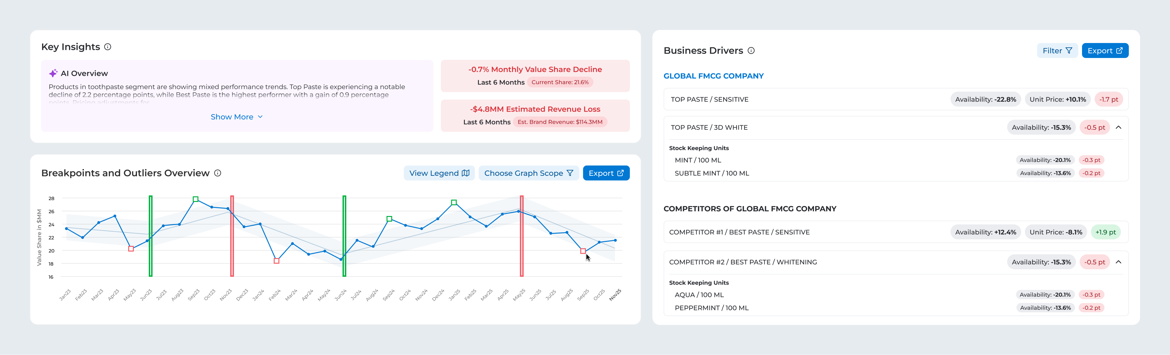
The design also didn't emphasize the most important part of the application, the business drivers section, while many features within table view at the bottom were underused.
Data from Google Analytics further confirmed low engagement with several features. Almost all activity, around 99%, was concentrated in two main features (Business Drivers and Subscription), while the newer ones remained largely underused. Considering the significant maintenance costs and persistent backend issues in these less-used areas, I proposed removing the two underutilized features from production to support cost-saving and UX improvement efforts.
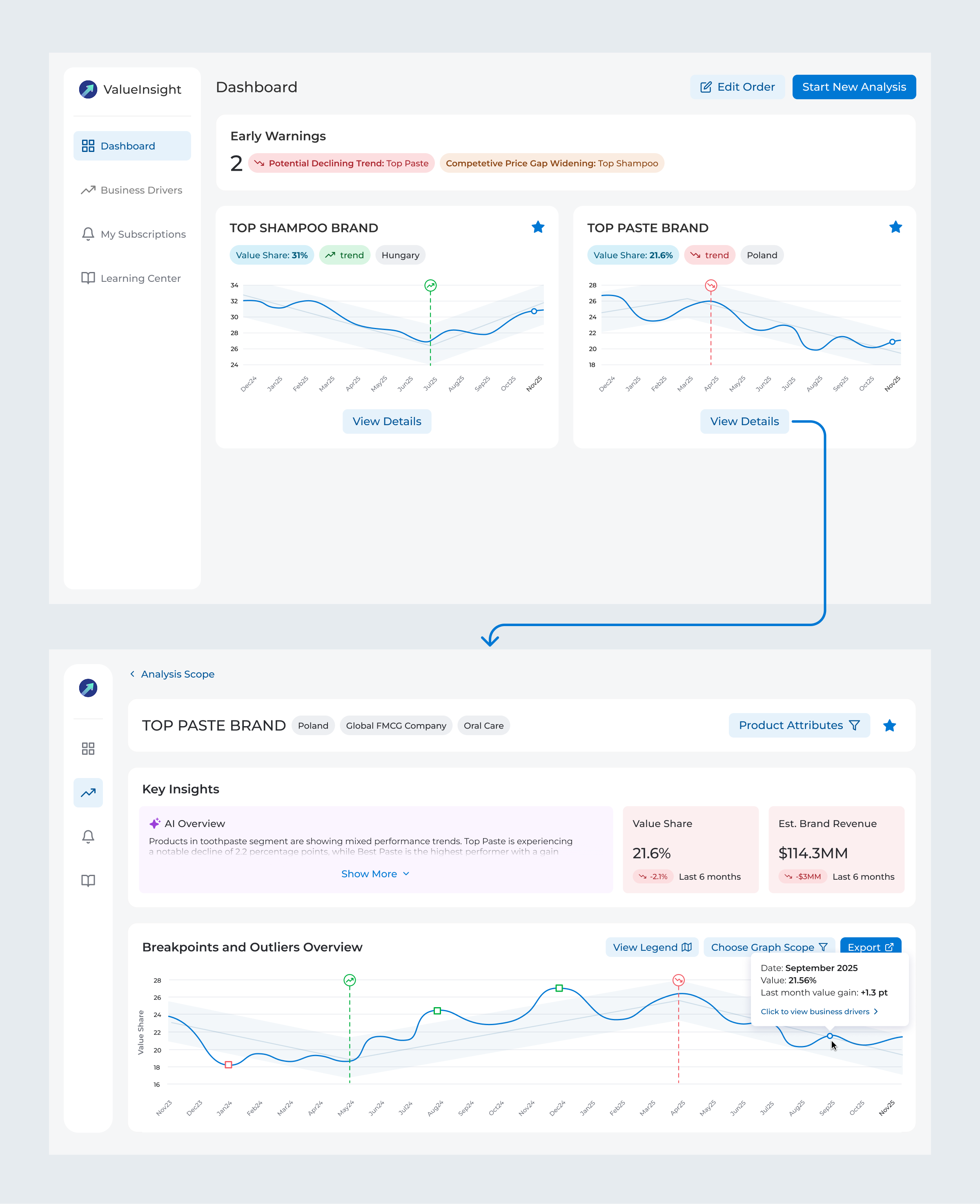
The new concept introduced a sidebar that allowed easy switching between features. Although only two features remained after removing the unused ones, the sidebar was designed to support future growth as the application expanded.
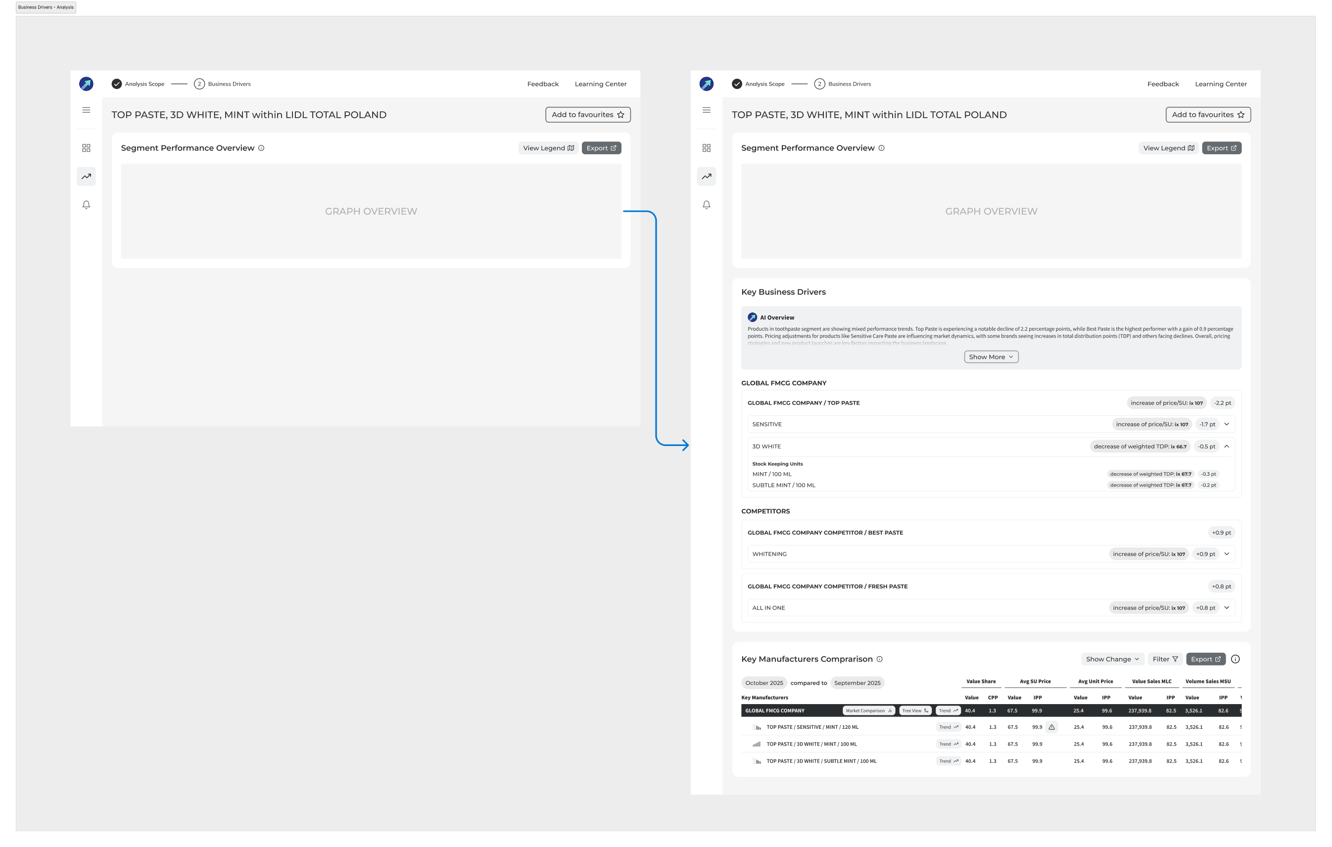
Another key addition was creating a main page with saved searches and dividing the business drivers analysis into a two-step process. The previous design made it difficult to switch between different searches, forcing many users to manually re-enter data each time they wanted to analyze something new.

I would like to see at a glance who's winning and losing in value share, and whether it's a consistent trend or just a one-off spike.
I'm used to copying and pasting the business drivers into my reports to summarize the data. Looking at this new design, I'm not sure how I'd do that anymore.
I conducted 5 usability testing sessions to validate the new design direction. The sessions confirmed that the new approach for selecting data for analysis was well-received by users. They also revealed additional opportunities for improvement in the business drivers section.
I went through multiple iterations of the metric snapshot cards in key insights to get the readability right. The value share graph started with sharp edges but tested worse than the smoother, rounded version that ended up shipping. Business drivers also changed significantly - starting lean and eventually expanding to include status tags and competitor metrics.
The final design preserves patterns that users were familiar with and reported working well. This includes the ability to open performance summaries by clicking on data points and view everything on a single page.
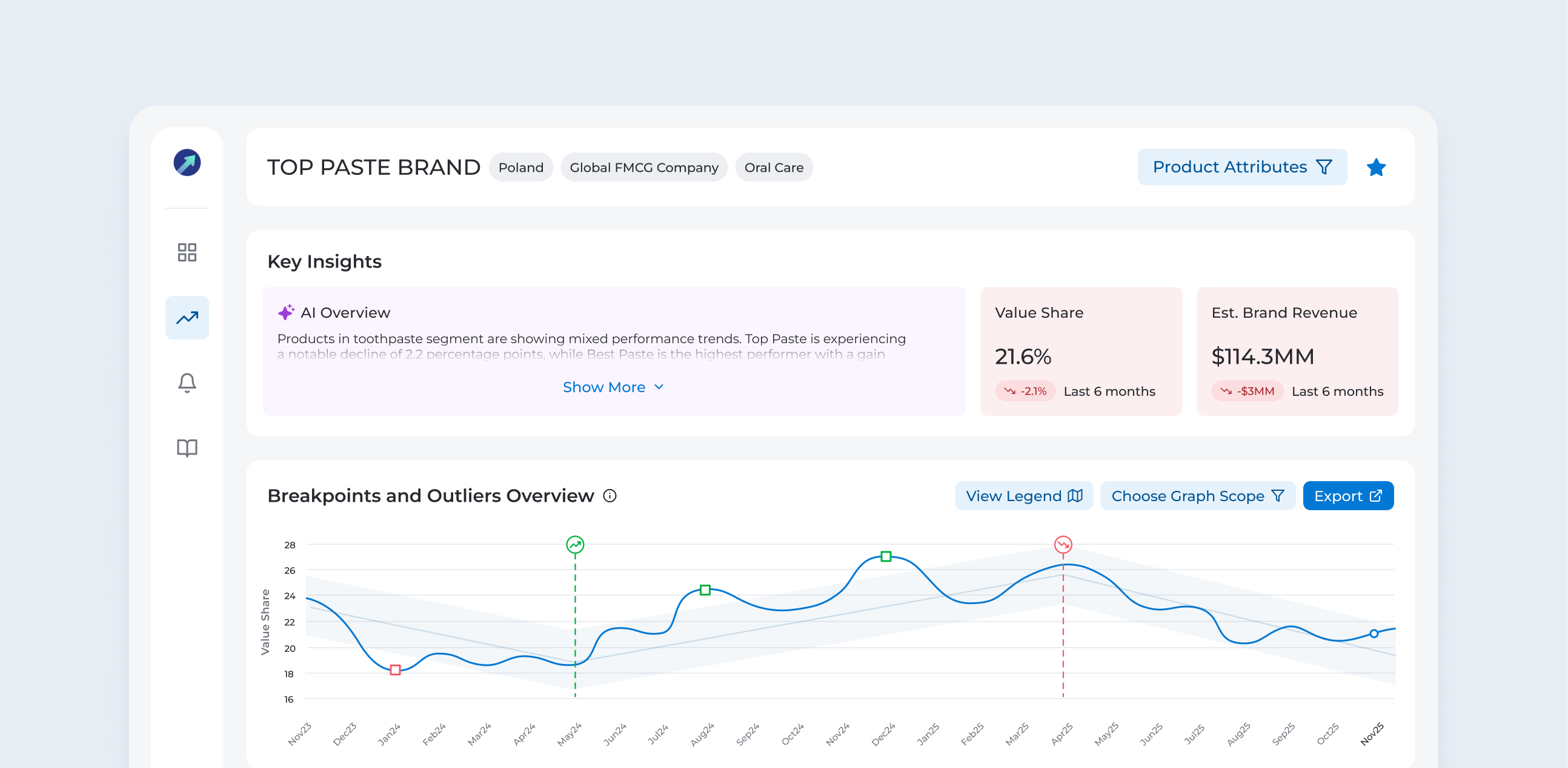
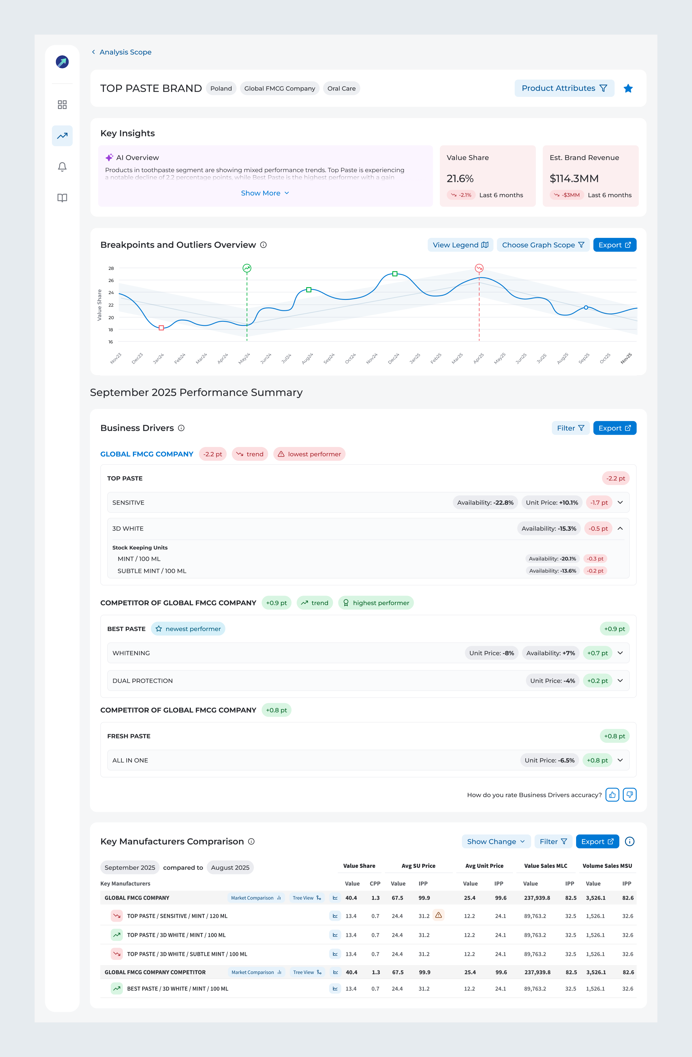
The analysis page now includes Key Insights, designed to help users quickly understand the brand’s condition. The AI summary highlights key recent changes and recommends actionable steps to improve performance.
The business drivers section experienced the most significant changes, with new structure that aligns with how users usually analyze the data. The table view was enhanced to improve the discoverability of nested features that had previously been underused, along with improving overall readability.
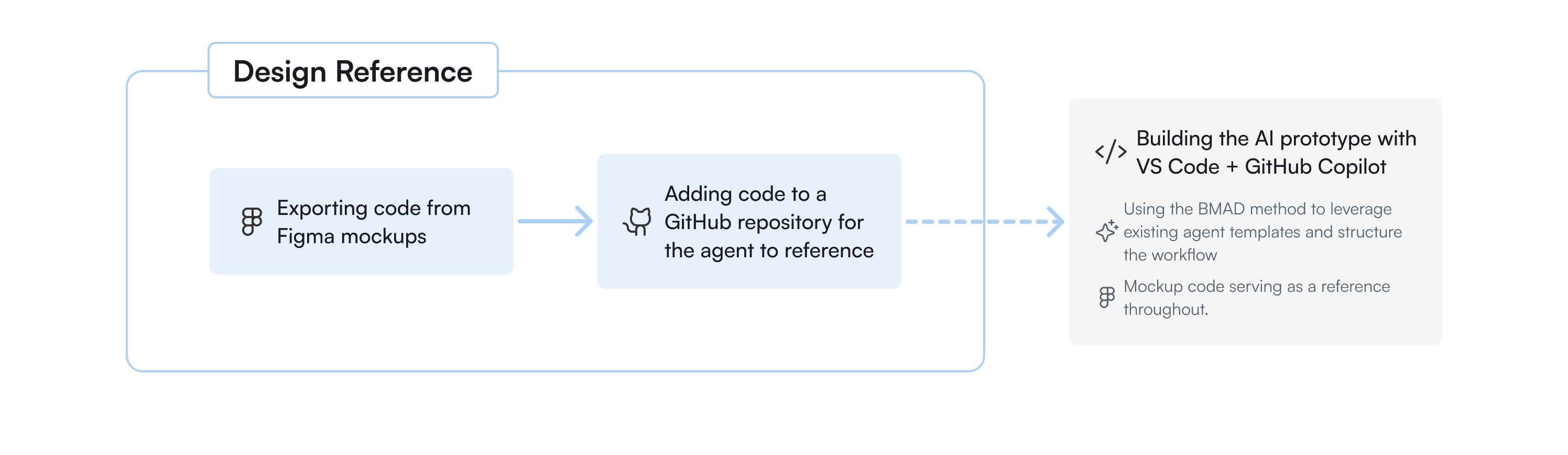
After finalizing the Figma design, I began exploring options to implement it as a proof of concept with the help of AI tools. I treat this phase as part of the development handoff, which allows me to collaborate closely with the dev team by creating portions of functional code using VS Code + GitHub Copilot, as well as engaging the team in providing data endpoints to feed the prototype with real historical data.
With the prototype nearly done, the last piece was making it shareable. I'd been working fully locally up to that point, so I needed a simple way to get it in front of people. GitHub Pages turned out to be the perfect fit - easy to share with anyone in the organisation, no complex setup needed. With a bit of AI help, I deployed it myself and kept development effort to a minimum.

The last piece was making sure we had enough confidence to justify turning the prototype into a real product. I brought in 7 current users who agreed to act as design partners - each going through a detailed testing session, sharing their feedback, and rating the prototype on a scale of 1 to 5 once their input was addressed.
Average across all sections, each rated separately. A 5 meant ready to implement, a 4 meant strong potential with minor refinements needed.
• Conducting a follow-up SUS survey one month after launch to compare results with the baseline score
• Monitoring Google Analytics data to validate whether feature usage is improved
• Measuring impact on time on task and success rate
Importance of domain knowledge - This project required me to dive deep into market analysis and understand the specific metrics and hierarchies users relied on to boost category performance. All of this domain research allowed me to design solution that genuinely supported existing user workflows.
Diverse user perspectives - Early in the research, I encountered conflicting feedback that seemed contradictory. The situation became clear only after identifying different patterns across personas. What appeared to be conflicting needs were actually different requirements for distinct user groups.
Qualitative and quantitative data work best together - The interviews revealed which features were underused and why, but only after implementing Google Analytics, I was able to confirm these patterns at scale.